Great content begins with powerful graphics. You can’t download any pretty PNG from Shutterstock to make people take the time to stop and look. Your visual elements catch the attention of your audience and help them immediately decide whether or not your content is worth reading. What message are you sending?
Whether it’s a Facebook update, blog post, advertisement or website; here’s a few questions you need to ask yourself:
1) Are my visuals quality?
How many times have you seen an article or blog post on LinkedIn or Facebook, but you pass it over because of the preview image looks cheap or distorted? Whether you realize it or not, you probably have. Companies like iStock Photo and Shutterstock make it easy to go from OK to picture-perfect in just a few quick clicks. Search by category or browse popular graphics for new ideas. Both sites offer affordable business packages so companies and independent artists can purchase a plan or pay-as-they-go.
2) Are my graphics brand-friendly?
Every brand has a special style or tone – great brands feel like distant friends; they have a personality. Your graphics need to match that personality. Look at your website, company colors, current graphics, do your new additions show the same tone and feel? If your company produces fine goods, does the photo carry the same sleek, expensive, luxury feel you want your products too? If your brand uses campy humor to appeal to tech savvy generation X-rs, is the photo bringing some of that to the conversation?
3) Is the image relevant to my audience?

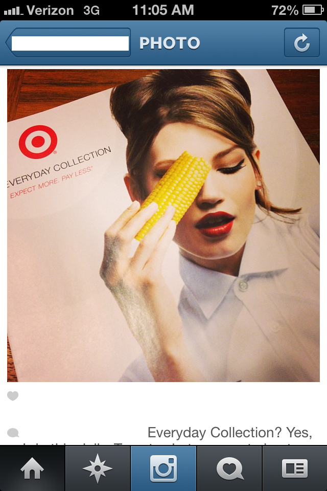
Recently, Target launched a new print campaign to drive awareness of their new grocery departments. According to Bring Me the News the campaign used super models posing with produce, cleverly coining it their “Every Day Collection”. Target wanted to grow awareness around their offerings and make the everyday and affordable feel fashion-forward and fresh. If you read the article above you’d understand why this model looks like she’s trying to seduce corn on the cob, however; the rest of us didn’t get it.
A few of my friends/followers on various social networks posted the ad, making fun of it. One mom blasted the ad, “Yes, I definitely put on my best red lipstick and lean on corn every single day!”
Do the quality of the graphics carry the target brand? Absolutely. But the visuals while in line with their campaign strategy aren’t relevant to their audience. Most women don’t think of super models and winged eye liner when they’re ready to go grocery shopping. Most of us don’t see ourselves when we look at that ad. So Target’s fresh, humor about a fashion-forward ‘everyday collection’ fell flat.
4) Is there an emotional value?
Look at your visuals, it needs to tell the same story your heading and copy does; with feeling. Products shot with the right lighting and angles can definitely create desire. Photos including a family like yours using those products attaches an emotional value to it. Blog posts on work-life with photos of office interiors won’t grab readers the same way a head shot of a young professional does.
What do you think? What graphics do you respond most to? Let’s be friends; comment, question and tell all below!


That model does really love that corn! Hilarious, great post.
Thanks, Jason! Glad you enjoyed it1
Got me thinking, Naomi. I need to make better use of images. It’s something I struggle with because I do the writing and then often the image is just an after thought. But I do realize that good visuals attract attention and this is a good reminder for me to do a better job with them.
Glad it got you thinking, J-D! Great visuals and great writing go well together!